Tuesday 8 May 2012


Monday 23 April 2012
.jpg)

Friday 30 March 2012
Saturday 10 March 2012


Friday 10 February 2012


Sunday 5 February 2012

Thursday 2 February 2012

Friday 20 January 2012
Initial questionnaire results (expanded)
My first question was about what gender you were and from my results I found out that more women answered my questionnaire which would mean the answers would be more to a feminine side than a male side and that I should aim my magazine at a female audience.
The next question was about age which concluded that most of the people I asked were aged 16 this would make the answers of my questionnaire be more teenage than adult. So to make my magazine successful then I should maybe target the magazine at people aged 16 and above.
My third question was about whether you buy music magazines. The results were that over half of the people I asked said no which would make some of my results inaccurate, which may contribute to the successfulness of my music magazine because if they answered questions about a music magazine and they haven’t brought one then it could be unfair and would make the magazine unsuccessful.
I then asked if they bought a music magazine then how much would they pay, from the results I found out that half of the people that buy music magazines they are willing to pay between £2 and £2.99. So to make my magazine successful I will price my magazine between £2 and £2.99.
I then found out from my questionnaire that the people that brought music magazines they buy them on a monthly basis. So this tells me that to make my magazine a success I would release it on a monthly basis.
From my initial questionnaire the people that I asked told me a range of different artists and bands that they listen to. This shows that by making an alternative magazine I can provide something for everyone so by doing this a range of different people would buy my magazine so it should be successful.
I asked people what colours they would like to see on a music magazine and the two most popular choices were red and black so when making up my colour schemes I made sure that they either had red or black in them or both of the colours together. By using colours that people like they will be attracted to my magazine and this will prompt them to buy it. This feedback will help me to produce a successful magazine.
The next question from my initial questionnaire was about the genre of music people most liked. The feedback I gained was that most people liked Rock, but I had a range of different responses so this has helped me when I produce my magazine so I can make it suitable for the right audience.
The feedback from my question about whether they wanted the magazine to be informal or formal, 75% of the people that I asked said they would like the magazine to be informal. This is going to help me when writing the article for my magazine because I will use some informal language so it is suitable for my target audience.
The final question that I asked was which way do you like to purchase music, either download or buy from a shop. 53% of people said they would rather download music so this tell me that I may include a free download to tempt them buy my magazine, which will also make the magazine successful.
Thursday 19 January 2012
Focus group questionnaire on my alternative music magazine
Which fonts do you like the most for an alternative music magazine general font e.g. cover lines and main article?


What do you think of the layout of my front cover? And what could I improve on?
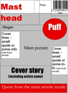
Too cluttered with cover lines with a larger mast head in a bolder font.
Organised with well-placed cover lines. Mast head stands out well and the pull quote is nice and large.
Looks a little bit messy
Its well organized but I would prefer the date/barcode at the bottom.
What do you think of the layout of my contents page and where could I improve?
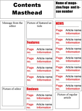 Nothing wrong with the contents page.
 It is good but the pictures could be larger.
The layout is good.
Well Organised, very good!
What do you think of the layout of my double page spread and where could I improve?

The picture should be placed on the left hand side instead of the right so then the writing would be on the right so people see who the article is about first.
Nothing is wrong with the layout of the double page spread.
Nothing could be improved.
Good layout and style.
These are the best choices for the colour scheme of my magazine which one do you prefer for an alternative music magazine?
 RED, BLACK, WHITE
1 person liked this one
 BLUE, BLACK, GREY
1 person liked this one
 YELLOW, BLACK, RED
3 people liked this one.
 YELLOW, WHITE, BLACK
 The conclusions I have come to from the feedback I have received from my focus group are that the main font that I will use for my cover lines and article is a Berlin sans FB. I will also use impact for my mast head because it is a large font and is clear to see which stands out from the other fonts that will be used on the front cover. By asking the first question it has contributed to what style of fonts people like.
From the feedback I collected about my front cover the main change that I will make is the placing of the barcode and make the cover lines smaller so it doesn’t take up too much of the page. The rest of my feedback was good so I will keep the rest of the front cover the same.
When asking about the layout of my contents page I have decided that I will make my pictures slightly bigger because the rest of the focus group liked the layout of my magazine.
The main part of my feedback for my double page spread was that I needed to swap the pages around so the double page spread was first so the artists was recognized first.
I asked which of the four colour schemes people liked the most and from this most people liked the Yellow, Black, and Red. So I have decided that this is the colour scheme I will use as it is the most popular of the focus group.
Subscribe to:
Posts (Atom)