
Typography – the typography that is used is a sans serif font because this makes each cover line noticeable and it has its own individuality. When the word ‘the’ is used they use a serif font which makes it stand out on its own.
Layout – it is a fairly ordered front cover but by using lost of different sizes of font it makes it seem cluttered when you look at it from a distance. The key things like the masthead are placed in the top left hand corner where the root of the eye starts. Then you have the main image which covers most of the centre of the front cover so it shows you what the main article is and then below it there is the cover story which tells you who the main article is on.
Colour – the main colour scheme that is used on the front cover of Q magazine is white red and black. The red is used to contrast the white and black and makes the main lines and words stand out from the other writing on the page. Although the colour scheme is red, white and black, the black doesn’t feature on the front cover as much as the white and red.
Camerawork – the central image shot is a close up as the shot is focused on his face and is nearly the size of the front cover so you know who the main article is about. The other two images on the page is a close up and the other is a close up two shot but these images are smaller and in the background as they feature in the magazine but they aren’t what the main article is about.
Mise-en-scene – the costumes that they are wearing seem to be very plain and dont have any writing on. The colours of the clothing used doesn’t clash with the colour scheme of the magazine so they stand out as the coat is green and the background images are wearing t shirts which are light and dark blue but the second person in the two shot is wearing white so he blends in with the background which shows he isn’t part of anything main in the magazine. In the images there aren’t any props or setting used.
 Q magazine contents page
Typography – the font type is a sans serif font as it is plain and not italics. They make the name of the artists bigger and bolder than the other writing to make the name stand out so if you dont like one of the artists you know not to read a certain page.
Layout – the layout of the contents page is very ordered as the list of contents aren’t in all different places on the page. The title Q contents is in a conventional place where usually the title would go which is across the top of the page. Then the contents and names of articles are listed on the left hand side of the page with the artists name and page number, and the underneath in smaller writing is has a little insight to what the article is about. The main image covers the whole right side of the page and then it has two smaller images which relate to the other articles in the magazine.
Colour – the colour scheme is continued on this page with the red white and black but the main image has some bright colours on for example the pink and purple, so it makes it stand out whereas the smaller images use neutral and darker colours.
Camerawork – they use a mid shot for the main image on the page so it gives a bigger impact on what the image is showing and makes the artist clearer. The two shot uses a close up to show the emotion and impact on what the article is about and it also clearly shows who the men are just by looking at the image. The other image on the contents page uses wide long shot because is shows the setting of the image but also shows all five members of the band but you may not know who they are so you look at the image and then if you dont know who they are you may want to read more about them if you like their presence of the image.
Mise-en-scene – their is only the presence of a setting in the image at the top of the page because it look like it is set in the middle of nowhere and is in a very rural area this shows that it may not be set in the Uk but is maybe set in America which also fits in with what the article is about. The props that are used in the main image are the gun and bullets which signifies violence which may be something to do with the band. In the top image the props used are a guitar and a tambourine which shows they may play acoustic music. The costume of the main image is very minimal. In all of the images the costumes are very dark.
 Q magazine Double page spread
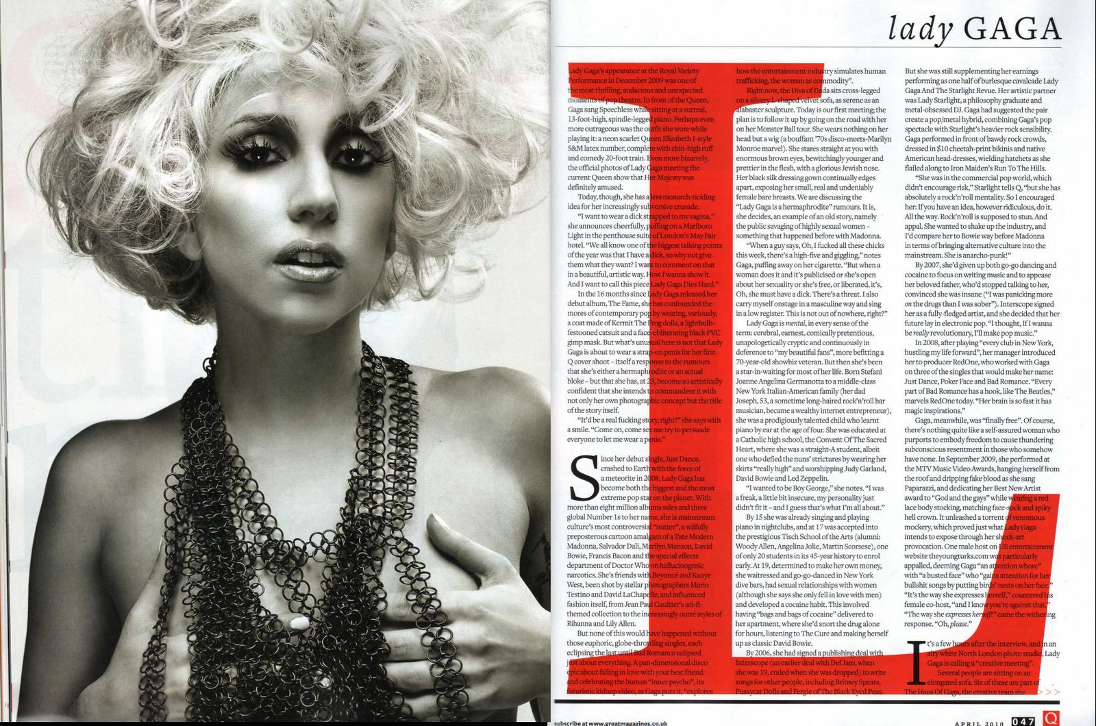
 Typography – the typography that is used in the article is a san serif font but there is the use of a serif font at the top where it says ‘Lady’, but the ‘GAGA’ is in a sans serif font, by doing this it is trying to put emphasis on her name to make it stand out. They use a kicker to start two parts of the text this shows it goes on to a different subject of the article. They use the ‘L’ to cover the page so it gives significance to the artist ‘Lady Gaga’.
Layout – the layout is very ordered because the body of text is on one page and in columns so you dont get confused what to read next. The left side of the page is just one image of ‘Lady Gaga’ so you know who the article is about. They dont use a headline, standfirst or a byline for this article, the only thing on the page that could be used as a headline is the name in the top left corner.
Colour – the colours used are just the colours of the colour scheme for the whole magazine which is the red, white and black. Because there isn’t really any colour on the picture of the artist. This shows the magazines individuality because it keeps their main colour scheme on each page.
Camerawork- the image shown is a medium close up as it shows her from the chest upwards which focuses on what she look like and shows that she is only wearing a necklace.
Mise-en-scene – there is no location shown or props used in the image. The costume used is just a black chain necklace which might signifies that she is being stripped bare in the article and it can also show she is very vulnerable in the article. The make up used is very dark as she has very dark eyelids and her eyelashes are long and black this may also relate to the significance of the type of article that it is.

NME magazine front cover
Typography – most of the text on the front cover is in a sans serif font so it is bold and stands out. There is one use of a serif font which is the word ‘of’ at the top of the cover. The masthead is in a big bold font the same as the main articles artist name so it makes it stand out from other things on the front page.
Layout – the layout is very ordered as the cover story is along the bottom with a quote from the main article above the artist name. There is only one other cover story on the cover which makes the front cover seem plain but also doesn’t make it cluttered.
Colour – the colour scheme from the front cover seems to be white and black which makes the magazine look very professional and has a clean image. The use of red hair makes the artist stand out on the cover.
Camerawork – the camerawork used is a close up of the artist which shows her facial expression which is very bland. By not using any other images on the front cover it looks very focused on just one artist and not giving you much of an insight to other articles or features in the magazine.
Mise-en-scene – the make up used is very white as she looks very natural and they only use a little eye shadow and mascara. The main focus is on the colour of her hair which is a very bright red colour so she stands out and it might draw your attention to the magazine more by using just one bold colour.

Typography – the font style used is a sans serif font because they dont use any italic writing on this contents page. They call the contents page NME This Week which shows individuality from other magazines and this is in big bold letters. The articles are separated into different sections and it has the section in a large font then the page number and article name in a medium font then it has the description in a small font so this isn’t the main part of the article.
Layout – when you first look at it, it looks slightly cluttered but it can be seen as ordered because it has the band index down the left side and the articles down the right side. It also has a little information about something recent that has happened but isn’t a main article. They also put subscription to the magazine information at the bottom so this would be the last thing you look at through the root of the eye and by doing this it may prompt you to subscribe to the magazine if you like what is in this issue.
Colour – the colour scheme seems to be red white and black which could also be seen on the front cover but red wasn’t a main colour used but they use a lot of red on the contents page to make certain things stand out. They also use some yellow to make the subscription stand out from the rest of the text on the page.
Camerawork – there are two main photo’s used which are both long shots but are also two shots which shows two different bands and both shots are from the side of the people so it doesn’t show who they are clearly.
Mise-en-scene – the props used in the images are the instruments that the band members are playing. Theses show that they aren’t singers but they are the people that play the instruments within the bands. The costumes look like everyday clothing in the left photo but the other photo they seem to be in more formal outfits which may show they like to be formal and presentable to any type of audience.

Typography – they use a sans serif font for the pull quote that looks like a headline which looks like a newspaper cutting. This suggests that it looks to be aimed at people between 16 and 25 as it looks good and makes an impact when you look at it. They put the byline in the same font as the headline so they use one main font for the byline, headline and artists name. They put the standfirst in a smaller font but not as small as the article text this makes it stand out but not stand out as much as the headline. They use a kicker to start off the article then continue to use a sans serif font so it isn’t a mixture of different types of font.
Layout – the layout is very ordered because the headline is at the top half of the page then below is the standfirst then below that you have the columns of text so it is all ordered and most of the text is on one page so it isn’t too spread over the page. And on the right page it is mostly covered by a medium shot image of the artist.
Colour – they stick to the colour scheme throughout the magazine as they keep the red, white and black and even stick with it through the costume. The black and white have the most impact on the double page spread as it is used the most which is professional.
Camerawork – the shot of the artist is a medium shot as it shows her from waist upwards which shows how she is standing and her facial expression.
Mise-en-scene – the costume used fits in with the colour scheme of the magazine as she is wearing a red, white and black check shirt so they try to keep everything professional and not go off on different colours that aren’t mainly featured in the magazine. The make up is very dark too which may also be purposely done to fit in with the colour scheme.
Kerrang front cover

Typography – The masthead and cover story are near enough in the same size font so they stand out the mot on the page. The entire font is in a sans serif font and there isn’t any use of serif fonts so they want to keep the magazine style simple.
Layout – the layout seems to be cluttered as there are cover stories above and below the main cover story.
Colour – the main colour scheme is black red and white. The red is used as a highlight to make the main things on the page stand out from the background so it grabs your attention.
Camerawork – they use a close up for the main image and they also use a close up on three of the other images used on the front cover but one is a medium shot of four people.
Mise – en – scene – in all five of the images they are wearing jackets and they are either denim or leather so they are in keeping with the colour scheme because they are black or very dark colour denim.

Kerrang contents page
Layout- the layout seems to be cluttered as they have the main promotion for the magazine across the top half of the page. Then the rest of the content underneath which isn’t conventional of a magazine. The contents are in columns at the bottom of the page which is usually conventional of a double page spread and not a contents page.
Colour – on the front cover they used the colour scheme of red white and black but on this page they have substituted the red for yellow, but the yellow is also used as a highlight for the main points which is what the red did on the front cover. There is some use of the red on the contents page but not as much as it was on the front cover.
Camerawork – they use two different shots used for the images shown which are close up shots and medium shots which shows the expressions and body stance in the photos.
Mise-en-scene – the costumes and make up are very dark which fits in with the type of magazine. By wearing dark colours it connotates evil and death so they may play rock music because that is what is associated with black and other dark colours.

Kerrang Double page spread
Typography – the typography is still a sans serif font which is still keeping with the style of the magazine and keeps it very simple and easy to read. The headline is in a large font and then the standfirst is a medium font and the text is then in a smaller font.
Layout- the layout is ordered as the article text is in columns and they start at the top with the headline then below that is the standfirst and then the columns of text are below this. The main image has a page to itself which is conventional of the other magazines.
Colour – they continue with the colour scheme from the front cover which is red, white and black so they aren’t using too many different colours as a colour scheme usually consists of three or four colours so they aren’t mixing in too many colours. They even continue the colour scheme by making the images black and white.
Camerawork – they use mainly close up and medium shots which they have done on the front cover and contents page so they tend to stick with the same shot types so you see a repetition of these throughout the magazine.
Mise-en-scene – the props used are the microphone stands and the guitar which shows who is the singer and who plays the guitar within the band. The recording studio and performance/stage is used as the location/setting for the images. These all relate to each other and they aren’t all different objects that have nothing to do with what the article is about so they are all within the image of the magazine.